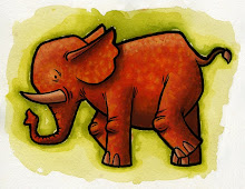
I spent my day off doodling out another cute mouse (and a fat lady wearing a peacock on her head.) But in a totally different style than the last one. I was going for "cute."
I like how it turned out, but then I turned off the layer with the black line work. And that's when it got interesting.
I almost like the second one better. It doesn't read as well as the first but I think it is more visually interesting. I wonder if I can figure out a way to combine the textures of this one with the flat color chapes of the last mouse. Must get to experimenting.
What do you folks think? Is there something interesting going on here? Should I pursue it?


6 comments:
Yes and Yes! You could use a subtler, more organic line to hint at the inner details of the mouse (i.e. eyes, mouth, toes). Very cool!
Absolutely—the second one is very interesting. It feels more modern than the first one.
I must admit I like the tail without the lines.
I also think the second one feels more modern and somehow more mysterious.
OHMYGOSH you DID do it again!!!
YES, abandon the lines and YES, embrace the texture and YES continue the cuteness.
And never look back.
Post a Comment