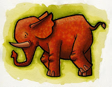
This is an experiment I'm working on for my portfolio. I've got a bunch of these ink drawings from work (the Chinese early readers) and I want to give them an interesting color treatment that has more appeal than the junky color they currently have. When I get a bunch of these together it will really beef up my portfolio which feels sparse and unfocused at the moment.
Which of these do you like? What's working? What isn't working? Please be honest, this is for posterity.


8 comments:
I like number 3. Fun color.
Jed
I like the second one... the marks around his head kinda echo the ones around his eyes. But the chalky feel of number three is also rather fun.
I like the first and second--especially the first because it includes the Round element going on inside of your pig (as well as the color) and also includes the chalky texture, but more subdued than the last chalky texture in 3 which is interesting, but somewhat distractin from your super adorable pig. The thing about 2 that I wouldn't like is the shadow underneath the dark green bg strokes. But I do like the energy.
I think all three are appropriate depending on what message your saying about your pigs mood. I like em--I'm absolutely crazy about blue and green together!
i kind of feel like the spots in number one are too perfect- to work, they'd need to be more organic like the drawing. have you thought of freehanding some??
I like the last one... because i like the chalk in the back... I think maybe the value contrast makes it stand out a little more? But I''m not sure about the green stripe in it. I agree with Madi about the circles. And I think the background in the first two kind of compete with the pig... And he's a great pig, he need's no embellishment. Maybe try to echo the simplistic design in the background?
Will, sweetheart, guess what, for some rare reason at the hospital today I was able to look at blogs, it was amazing!!
I like the 3rd one the best, I feel like you didn't push the color to much and make it perfect.
somehow I missed the little note at the top of your old blog that said you got a new blog. I just kept going back and finding nothing new. But now that I found your new blog it's like my life is once again complete. Kind of like some sappy romance. "here's looking at you kid".
just stop me when I've gone to far.
I like the bubble one
Post a Comment