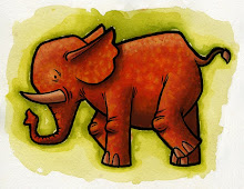
This is an experiment I'm working on for my portfolio. I've got a bunch of these ink drawings from work (the Chinese early readers) and I want to give them an interesting color treatment that has more appeal than the junky color they currently have. When I get a bunch of these together it will really beef up my portfolio which feels sparse and unfocused at the moment.
Which of these do you like? What's working? What isn't working? Please be honest, this is for posterity.


